How might we reduce friction in product discovery while still offering a breadth of choice?
COMPANY
lululemon
PLATFORM
Web & iOS
ROLE
Lead Designer
YEAR
2024
Established a product label strategy to guide users in navigating through our product assortment. As the lead designer for this project, I ran workshops, contributed to A/B test plans and worked together with various teams to create and align on a holistic strategy.
RESULTS
75% OCR and millions in annual revenues

Problem summary
Business – highlights are not clearly defined and have become a catch-all solution and term for a wide array of business priorities we want users to see.
Users – although highlights are intended to help users find products quickly, our existing strategy for highlights still leave users confused.
Ultimately, we’re missing opportunities to drive better conversion and retention, especially across core segments like new shoppers on web and high-value retained users on app.

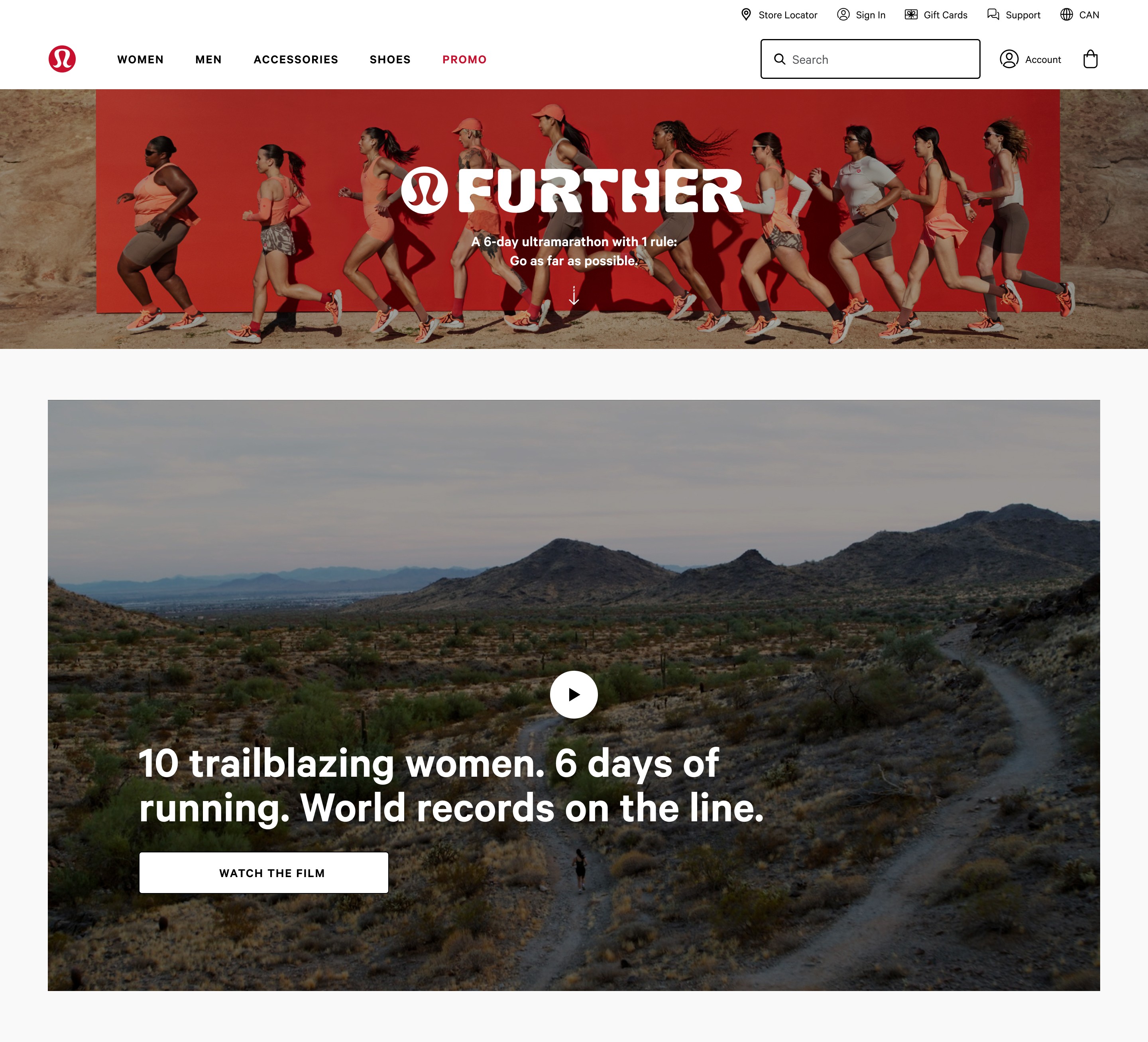
Some of the highlights across the digital ecosystem.
Goal: To create a unified system for highlights
The goal was to design a unified, behaviour-driven highlight system that could scale across platforms, which serve users with clarity, and align stakeholders under a single framework. That meant:
Establishing a shared purpose for highlights – not just what they looked like, but why they existed
Creating a system that was platform-aware and segment-specific
Reducing reliance on manual processes by introducing machine learning to scale behavioural relevance
Discovery and alignment
Before touching the designs, I led a series of working sessions across product, brand, data analytics and merchandising, to map out the lifecycle of a highlight: who creates it, how it gets surfaced, and what the user sees. What became clear is that the system is fundamentally reactive and brittle; it couldn’t adapt to scale, could’t flex for different contexts and would often break under competing priorities.
I ran a cross-functional audit to look at:
Inventory of current highlight types across web and app
Identify overlaps, conflicts and redundancies
Document all user pain points around confusion and distrust, collected from various UXR studies
I then facilitated a working group with the senior leadership team to reframe highlights not as marketing tags, but behavioural nudges – signals to help users feel confident and guided in their product selection.
Working assumptions
Users trust highlights more when they’re based on behaviour
Low-value, new web users need fewer, clearer choices to build confidence
Retained, high-value app respond better to personalized highlights
Manual workflows slow down iteration and make meaningful testing nearly impossible
Segment-based, platform-aware UX strategy
We designed a platform-aware A/B testing strategy tailored to how users behave on each channel, while accounting for the limitations on segmentation on web.
On web, users tend to be newer to the brand, with lower average order values and fewer transactions. Due to time constraints in our testing period, we couldn't segment A/B tests at the user level while maintaining statistical significance. Instead, we focused on universal social proof highlights, using fixed thresholds for velocity and view counts. While these were guided by AI-informed rules, they remained transparent and testable.
On app, where users have significantly higher lifetime value and deeper engagement, we introduced AI-enhanced personalization by integrating highlights with recommendation carousels. This allowed us to combine broad trust signals with behavioural nuance, making the experience feel more relevant without overwhelming users. It also enabled us to test highlight effectiveness within high-intent environments, where engagement was already elevated, leading to better signal clarity and impact measurement.
Introducing AI-enhanced highlight logic
In collaboration with the data science team, we began introducing AI-enhanced rules into the pipeline to shift away from entirely manual, business-driven selections.
We established a set of data-driven logic system to surface highlights only when specific behavioural thresholds were met, such as:
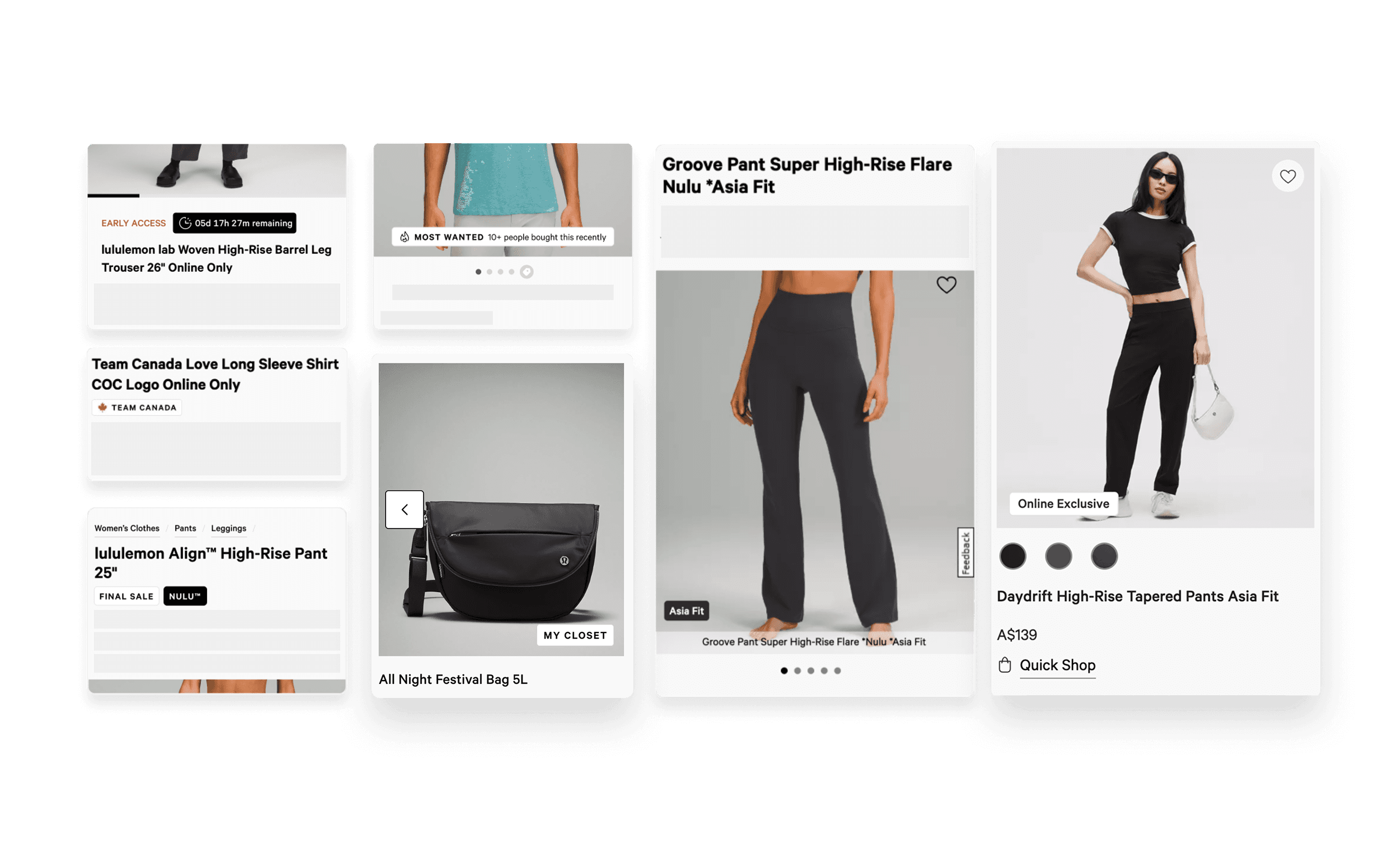
Popular Gift – only shows up during gifting periods. mainly focusing on best selling products
Top Rated – products that were highly rated (at least 4.1/5 and has at least 25+ reviews)
Back In Stock – products that were recently back in stock and has at least a level of inventory threshold
This allowed us to scale relevance, reduce manual overhead and test for UX teams to monitor, adjust, and test the impact of each rule.
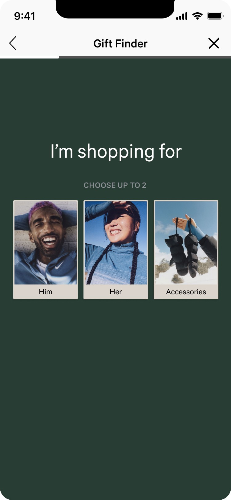
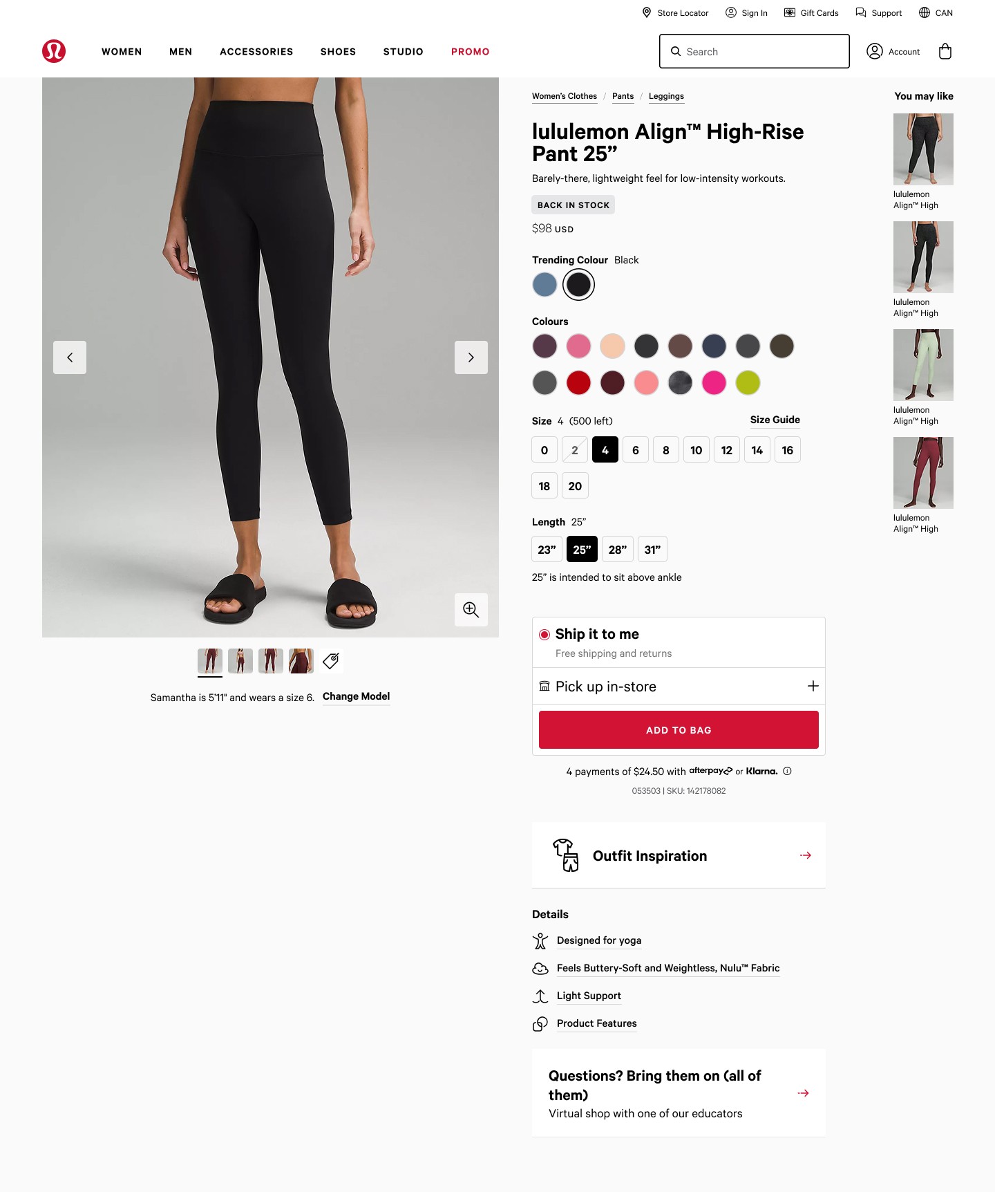
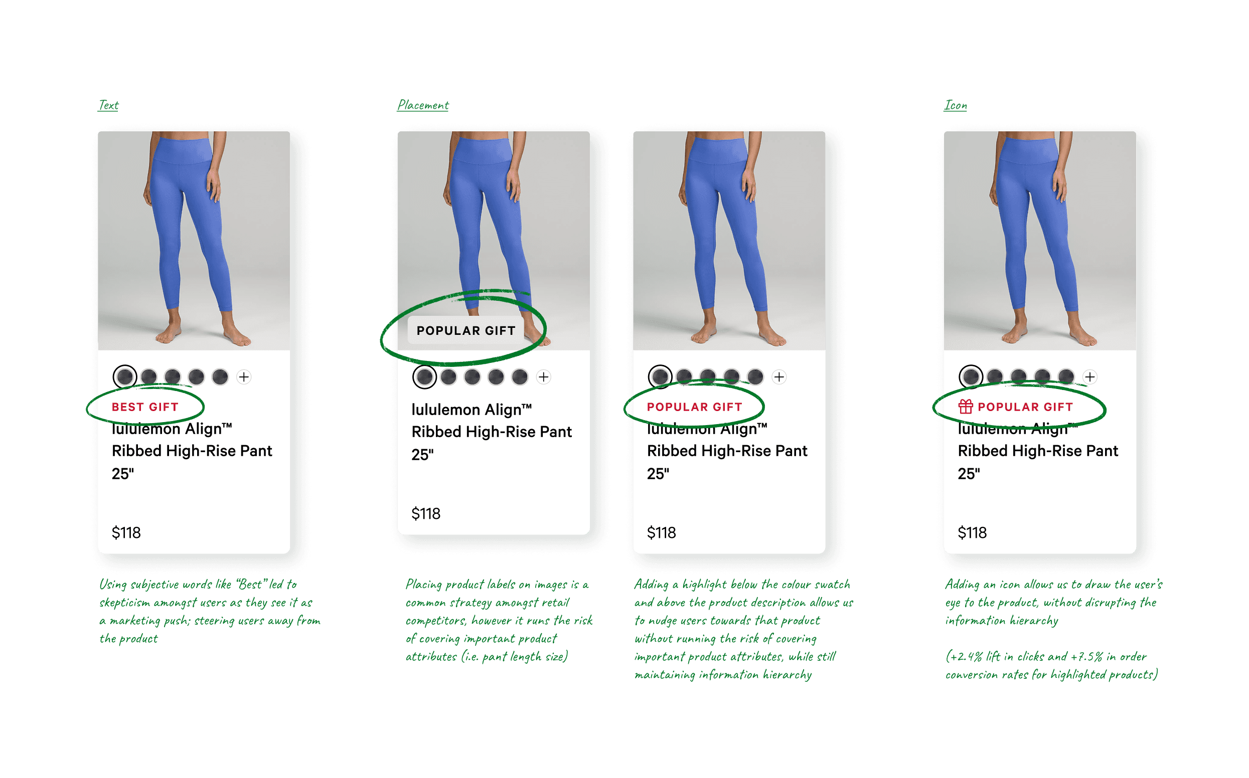
Testing UI placements
Besides working on the logic, I also tested various UI placements on how it would show up on the digital experience. Early on in the design process, I hypothesized that small changes in styling, like iconography, tone, and placement, could significantly influence how users interpret the highlight. To validate this, I ran a series of A/B tests in parallel with UXR studies across web and app, where I experimented with:
Placement – over product image, below product image and above product description
Adding visual cues (i.e. icons)
Label text – “Trending,” “Popular Gift,” “Best Seller,” “Back in Stock”
This allowed us to scale relevance, reduce manual overhead and test for UX teams to monitor, adjust, and test the impact of each rule.
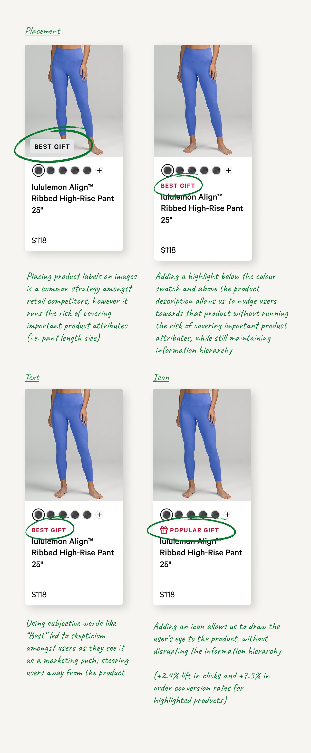
UI iterations for mobile web and iOS app
Results
This project redefined how product labels functioned across the organization. We went from a manual, campaign-based system to a scalable, rule-governed framework grounded in user behaviour. Key impacts include:
A +75% lift in order conversion rate (OCR) for highlighted products
4x increase in A/B test velocity (from 2 to 13 A/B in a year)
Products with a “Back in Stock” highlight outperformed those labeled “Best Seller” or “Trending,” driving a +2.18% OCR (vs. +0.83%). This suggests that restock-driven messaging resonated more with users, likely due to lower return rates and a stronger sense of urgency
Millions in annual revenues attributed from productizing winning A/B tests
Internal clarity across teams, reducing highlight conflicts and duplicated work


The team who made this possible.
Product
main partner in leading workshops and stakeholder reviews
UX Writer
partner in establishing clear guidelines for product labels
Engineering
building and iterating on the product
Data Science
collaboratively shape design strategy with evolving model behaviour
User Research & Analytics
collaboratively gather the right insights, run UX research and A/B tests
Other case studies